Web Design Assignment

Below are two website layouts that I really enjoy

IGN website
Game Informer Website

What makes them great?

These Both have amazing structure, consistency, and readability.

Usability and Design Characteristics

Consistency
Consistent design elements throughout the websites.
Accessibility
The designs arent overly contrasting or small or too big which makes it nice and accesible for all types of readers
Navigation
Both have a nice and neat navigation, but I personally like IGN's more
Images
They both use images to draw attention to the next thing they are talking about
Responsiveness
Both have great designs that wont get lost on a variety of devices.
Readability
Content is easily readable with nice font size and contrast.

Web Design Recommendations

Things that could be cool

  1. I really like how IGN's navigation bar scrolls with the page, I wish Game Informers was somewhat similar instead on remaining at the top, it kind of blends in and gets lost on the page
  2. For both of the websites I Love the Layouts but I wish they had some color
  3. The Call-to-action button on GameInformer is a significantly different color than the rest of the site so they eyes naturally draw to it, but on IGN the CTA is darker and towards the bottom of the navigation and can be easily skipped over if not really looking for it

Mara Nordquist's WireFrame Sketch

Wireframe Sketch Wireframe Sketch

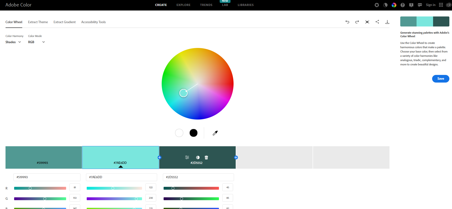
These are the colors that I would like to incorporate on my website